I’ve always been a little critical of my hometown paper.
The Houston Chronicle is Texas’ largest daily paper and has bureaus in the state capital of Austin and Washington, D.C. Established in 1901, the Chronicle beat out the other city newspaper — the Houston Post — in 1995 and has since become the Hearst Corporation’s largest daily newspaper. More than 2,000 people work for the Chronicle, including more than 300 reporters, photographers and editors.
The Chronicle is also the only one of the 10 biggest U.S. papers that hasn’t won a Pulitzer.
But I’m not here to blast the Chronicle for its shortcomings. Rather, for part of my Electronic Photojournalism class, I’ve chosen to review the Chronicle’s Web site, chron.com.
Let’s start with the homepage.
Right off the bat, here are a few design-/content-related items with which I take issue:
- No dominant image? I can understand why the Chronicle leadership would want to showcase three photos (and their accompanying stories) at the top of the page rather than display one dominant image. But this design choice instantly indicates to me that the Chronicle does not place much stock in visual impact or perhaps even visual quality. After all, the three photos on the homepage as of early morning on Sept. 23 are poorly toned for Web, and at least two of the three aren’t even photos taken by Chronicle staff.
- Those advertisements just kill me. It’s bad enough that Web sites for the Chronicle and many other major newspapers feature ads so prominently. It’s even worse that the big banner ad for the Chronicle is an obnoxiously colored CVS promo that unfortunately elicits more visual appeal than anything else at on the homepage.
- What color scheme? The chron.com banner and part of the link menu banner are green. The rest of the link menu banner is gray. The headline links for the main content are blue. Does this site have a color scheme? Maybe it does — but it’s not readily apparent at first glance.
One thing the homepage does nicely is place the search bar up near the top. And a cursory search for “Houston Texans” led me to a results page that is better organized and more relevant than many search results pages I’ve encountered on other news Web sites.
Something else the homepage achieves well is knowing its audience’s basic needs. While many news organizations push their real estate, auto and jobs sections to the bottom of their homepages, the Chronicle features these sections in one column along the righthand side of the page, directly below the ads.
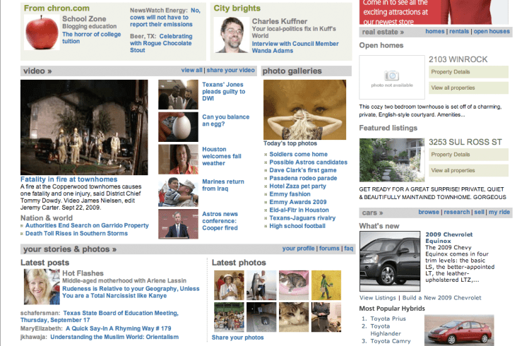
Scrolling down, the homepage’s visual appeal becomes much stronger. There are more photos. The homepage’s real estate is clearly divided into different editorial and reader-submitted sections, which is great for anyone who wants to zip right down to the “nation & world” section.
Unfortunately, clicking off the homepage results in more visual disarray.
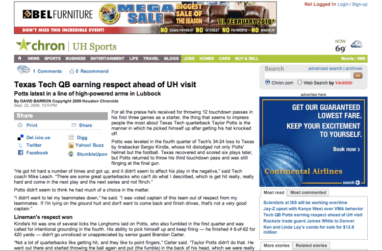
When I click on the leading photo of the current homepage — the story about the University of Houston’s upcoming game against Texas Tech — I hope to see some nice visuals, even if they’re wire and not staff material. Instead, the only visuals I get are more obnoxious ads, and there’s just a big, unappealing blob of text, with no photos or graphics.
Something else that truly irks me: the seeming absence of a photo index.
Squashed into a narrow column between the video section and the real estate section is something called “photo galleries.” Unlike every other section header — the bold sans serif type in a light gray box — the “photo galleries” header is not a hyperlink. If I hover my cursor over the “video” header, I can see that it’s a hyperlink that will direct me to an index page of the Chronicle’s various videos. The same applies to the other editorial and reader-submitted sections — except the photo section.
Instead, the homepage’s photo section presents a link to “Today’s top photos” and then, below that, a list of links to various galleries. The problem is, I don’t want to read what riveting content lies within these galleries. I want to see it. Whatever happened to providing thumbnails that would allow me a glimpse and entice me to click on these links? Why do the videos in the video section get thumbnail images and the photo gallery links don’t?
Another component of this Web site review assignment is functionality:
Look at the content of the site. Is it appropriate? Current? Understandable? What about interactivity? Can you navigate around the site easily? Are links clear and easy to find? Are there any pages that are dead-ends, with no way back except by using the back button on the browser?
As far as I can tell, chron.com does all right in all those respects. The top three stories as of now are all of local interest — no big headlines come in from the non-Texas regions of the U.S. Navigation can be a little clumsy because the top link menu banner is not interactive, meaning I can’t access the various subsections of the Sports section just by hovering my cursor over “SPORTS” in the menu.
All in all, the Chronicle’s Web site does a decent job at providing the information Houstonians probably want. But the visuals are in sheer disarray, and I personally wouldn’t hire whomever designed the Web site’s look.
Is this poor design quality and content delivery what Houston gets for being a one-paper town? Maybe. Kudos to the Chronicle for maintaining a fairly functional Web site, but it has a very long way to go before it can hope to rank among giants like The New York Times or The Washington Post.


Leave a comment