Because it’s that time of year again — internship application season — I’ve completely redone my resume.
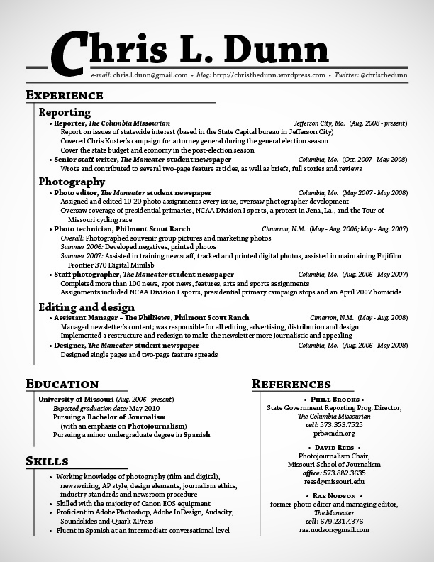
For two years or so, I’ve used a variation of the following format and style:
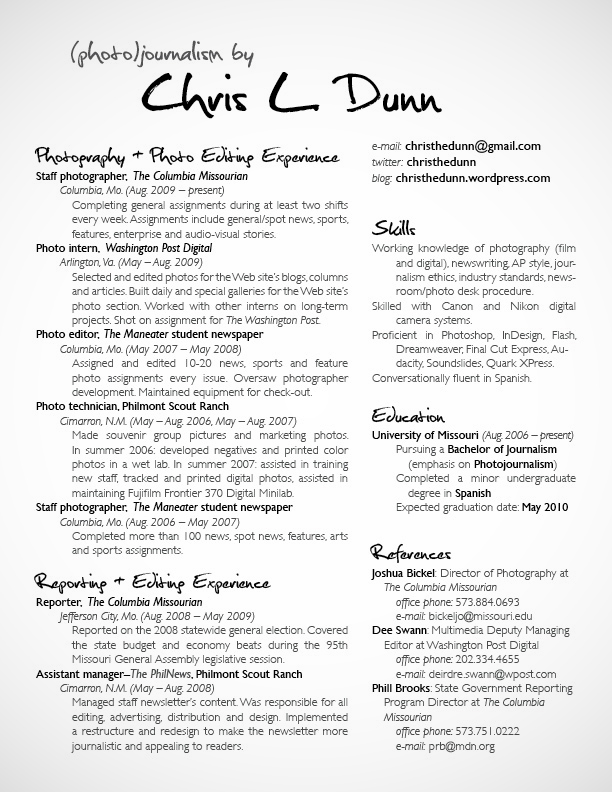
I’ve been pondering my new brand and style for several weeks. One thing that I knew I wanted to change was how regimented my old resume is. So last night, I played around, and here’s what I turned out:
My actual new resume is a little different from the one I’m showing and have uploaded. Namely, I removed my mailing address and cell phone number for privacy reasons and, accordingly, shifted the top heading (“(photo)journalism by Chris L. Dunn”) a bit.
But I really like my new resume. The new format — two columns all the way down, indentations instead of bullets and no lines — is clean, airy and organized. To punch it up a bit for impact (and save on what would be excessive costs for color printing), I’ve introduced an 80-percent opacity on the body text. Finally, the new heading typeface gives the whole page some pizazz and a creative feel.
Now it’s time to whip up a letterhead that’s congruous with this resume — and pump those applications out before deadline! Wish me luck. And, as always, I’d love to know what you think about my new (or old) resume.


