Because it’s that time of year again — internship application season — I’ve completely redone my resume.
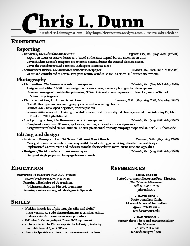
For two years or so, I’ve used a variation of the following format and style:
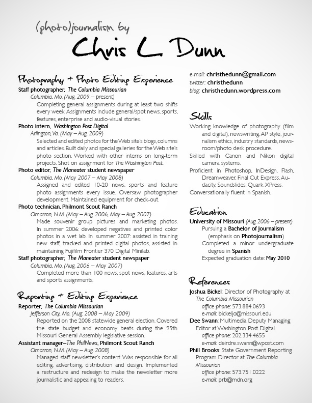
I’ve been pondering my new brand and style for several weeks. One thing that I knew I wanted to change was how regimented my old resume is. So last night, I played around, and here’s what I turned out:
My actual new resume is a little different from the one I’m showing and have uploaded. Namely, I removed my mailing address and cell phone number for privacy reasons and, accordingly, shifted the top heading (“(photo)journalism by Chris L. Dunn”) a bit.
But I really like my new resume. The new format — two columns all the way down, indentations instead of bullets and no lines — is clean, airy and organized. To punch it up a bit for impact (and save on what would be excessive costs for color printing), I’ve introduced an 80-percent opacity on the body text. Finally, the new heading typeface gives the whole page some pizazz and a creative feel.
Now it’s time to whip up a letterhead that’s congruous with this resume — and pump those applications out before deadline! Wish me luck. And, as always, I’d love to know what you think about my new (or old) resume.


The two-column format is what I’m currently using and it seems to work out well. The varied opacity is a good move, too.
I really like the new one! The font is fun but not too slack, if that makes sense. I also like that you moved away from the lines and somewhat ‘strict’ formatting. This way it seems to flow really nicely. Finally, I like your use of space – I can tell you’ve included a lot of valuable information, and I don’t feel like you had to make sacrifices, because of the two-column format.
Well played!
I really like your header, especially the (photo)journalism part since you’ve done so much print reporting. While I do like the 2 column idea it does throw me off a bit in the lack of symmetry but that could just be my. And I have one question, how many fonts did you use? I can’t really tell from this picture.
If you click on the image, you can view the full PDF. I used two fonts: one for the headings and one for all the body text.
I’m jealous you’re in a creative enough profession to get away from the more traditional fonts. Two columns looks great to me–I like that it alludes to an age when journalism still came out on paper.
For readability I’d want a little leading space on all the headers. Bold with hanging indents just isn’t enough for my eye; YMMV.
Maintained is an unfortunate word to have to use on a resume at all let alone more than once, but I’ve never come up with satisfying ways to get it off mine. Might I suggest you reduce it to one on yours with….
“Led photographer development. Oversaw equipment for check-out.” and “…printed digital photos, maintained Fujifilm Frontier 370…”. Assisted in maintaining is too weasely.
While you’re employing the newly fashionable ‘understood I’, I think I would do this too: “…Managed staff newsletter’s content. Responsible for all…”
Good luck in May!
You include this blog on your resume? That’s pretty decidedly putting yourself out there.
Journalists — especially visual journalists — are expected to have an on-line presence these days. I don’t have a live Web site (yet), so I use my blog to show that I’m an active, working photojournalist.
I need a template of this!!!! Awesome work.